
Manhattan and Worm Charts in Cricket: Reading the Scoring Curve
 Available in US
The Two Charts That Shape How Cricket Is Visualised
The first time I sat down with a cricket-mad father-in-law and watched a one-day international together, he kept glancing at the bar chart on the screen rather than the action. He was reading the Manhattan. He could tell from the shape of the bars where the innings had stalled, where the partnership had clicked, and where the death-overs assault was about to begin — and he was usually right within an over. That moment is when I realised these two graphs, the Manhattan and the worm, have quietly become the dominant visual language of cricket broadcasting. They sit alongside the scorecard on every TV graphic, every app, every live ball-by-ball page, and they reward a few minutes of learning more than almost any other piece of cricket data.
This piece walks through what each chart actually shows, how to read them together, and how the same logic works at club level where the scoring is done on a phone in someone’s outstretched hand.

The Manhattan: Runs per Over as a Skyline
The Manhattan chart is named after the skyline of New York — tall bars for high-scoring overs, short ones for tight overs, and the silhouette tells you the rhythm of an innings at a glance. Each bar represents one over of batting. The height of the bar is the number of runs conceded in that over, and a small dot or marker on top of the bar shows wickets if any fell.
The chart works because cricket innings have texture. A team chasing 280 in 50 overs does not score 5.6 an over evenly across the chase — they might tick over at 4 an over through the powerplay, drop to 3 in the middle overs, then explode to 10-an-over in the last ten. The Manhattan shows that texture instantly. A flat skyline with a few tall spikes tells you a different story to a steadily rising one.
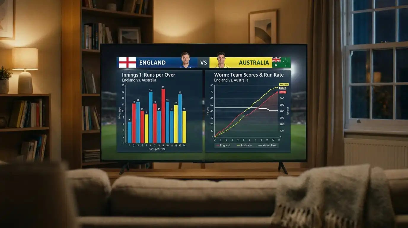
The colouring conventions vary. Most broadcasters and apps split the bars by phase — powerplay overs in one colour, middle overs in another, death overs in a third. Some apps overlay the two teams on the same chart so you can compare innings shapes directly. The wicket markers usually sit as small dots, crosses, or batter-name tags at the top of the relevant bar, which lets you see whether the tall over came at the cost of a wicket or as a clean assault.
The chart’s strengths are its directness and its memory aid. After a match has finished you can look at the Manhattan and remember the shape of it — the over the openers were broken, the partnership that rebuilt, the death-overs collapse. It is much easier to recall than a string of over-by-over numbers.
The Worm: Cumulative Run Curve
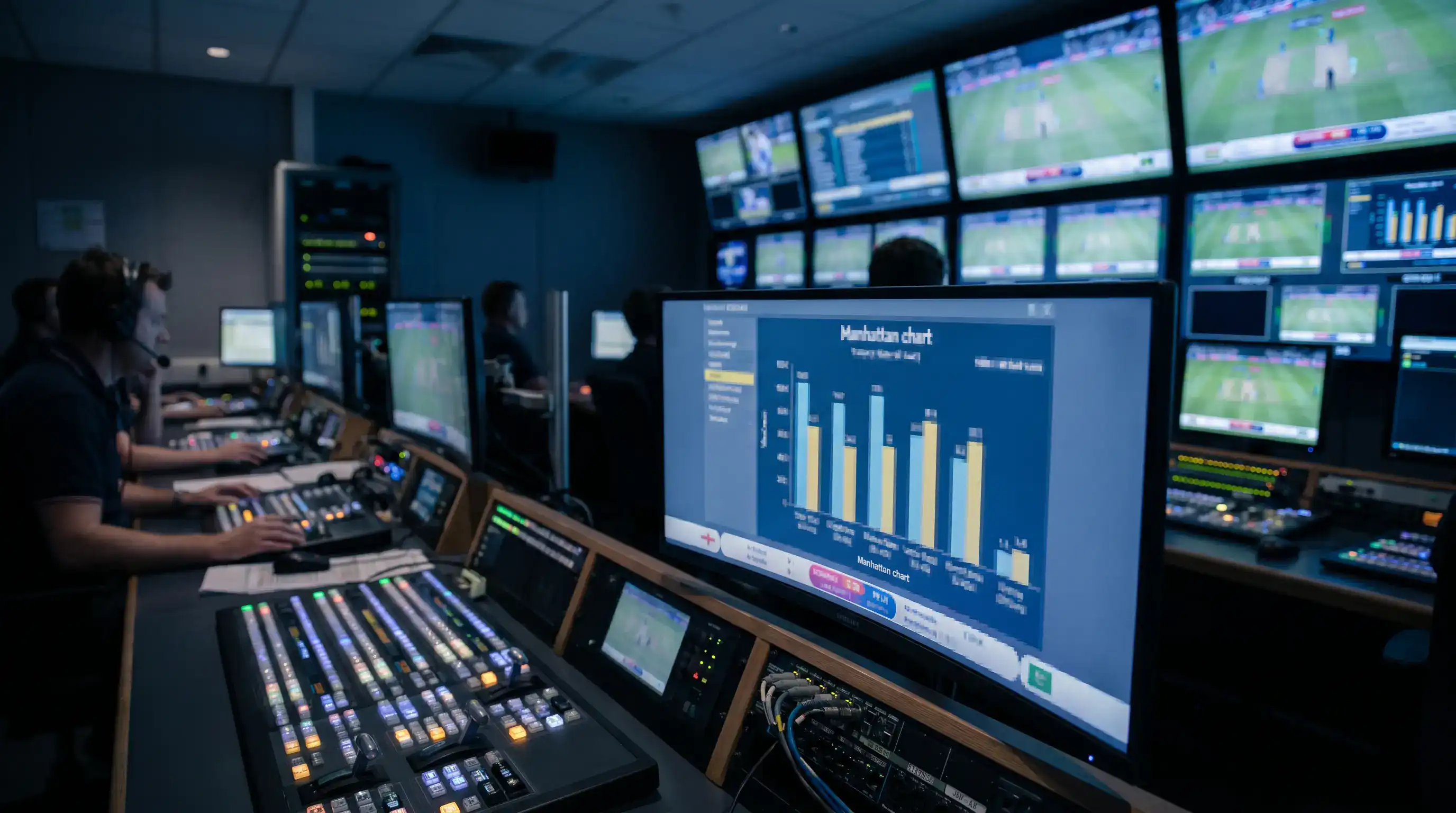
The worm chart shows the same data in a different shape. Instead of runs per over, it plots cumulative runs against overs faced — a single line that rises through the innings. A flat section means the team scored slowly; a steep section means they scored quickly. Wickets fallen are marked as drops or dots on the line.
The worm comes into its own when comparing two innings. Both teams’ lines are drawn on the same axes, and you can see exactly when one chase pulled ahead of or behind the target. In a chase, the par line — the score the chasing team needs to be on at that point of the innings — can be drawn on the same chart, and the gap between the chasing line and the par line is the running picture of whether the chase is in trouble or comfortable.
The worm is also where the DLS calculations become legible. When a rain interruption forces a revised target, the worm chart can show the original par line, the revised par line after the calculation, and the chasing team’s actual run curve. The chart will tell you, before the commentary has finished explaining, whether the rain stoppage helped or hurt the chasing side. DRS, by way of comparison, is behind about 15 per cent of Test wickets and lives in the umpiring decision data — but the DLS-driven worm is where rain-affected ODI and T20 matches get told visually.
Reading Manhattan and Worm Side by Side
The two charts answer different questions and they complement each other. The Manhattan tells you the rhythm and the texture of the innings. The worm tells you the trajectory and the position against the target. A good app or scorecard puts them side by side or lets you toggle, and reading them together is where the picture becomes clearest.
The 2024 County Championship season produced a striking statistical illustration of how reading rhythm and trajectory together matters. Across Division One there were 1,035 overs of spin bowled across the season — a sharp rise from 767 in 2023, when spinners had accounted for only 17 per cent of overs against 37 per cent in 2024. On the Manhattan, the spinner-dominated overs produce a different bar shape — tighter, more variable, with occasional taller bars when a batter goes after them. On the worm, those same overs typically produce a flatter line with sharper inflections. Looking at both at once tells you not just that spinners were bowling more, but how those overs were being played.
The other thing the side-by-side view does is expose the misleading shapes. A worm that climbs at a steady 6-an-over slope might look comfortable, but the Manhattan might reveal that the runs came from two big overs and a string of quiet ones — meaning a chase that depends on the same pattern continuing. A team chasing 280 with the worm showing them at 220 after 35 overs looks fine until the Manhattan reveals that the last ten overs all came from one batter who has just been dismissed.
Clare Connor, the ECB’s Interim CEO, made a remark earlier in the broadcasting cycle that broadcasters and the ECB have been partners for cricket for over 30 years, with a shared commitment to growing the sport. That partnership shows in the data graphics. The Manhattan and worm conventions you see on the TV scorecard, on the app, on the ground’s big screen, and on the radio’s accompanying website are largely unified across providers — they are not branded experiments but settled visual conventions, and that is a deliberate alignment between broadcasters and the governing body.
Club-Level Use of These Graphs
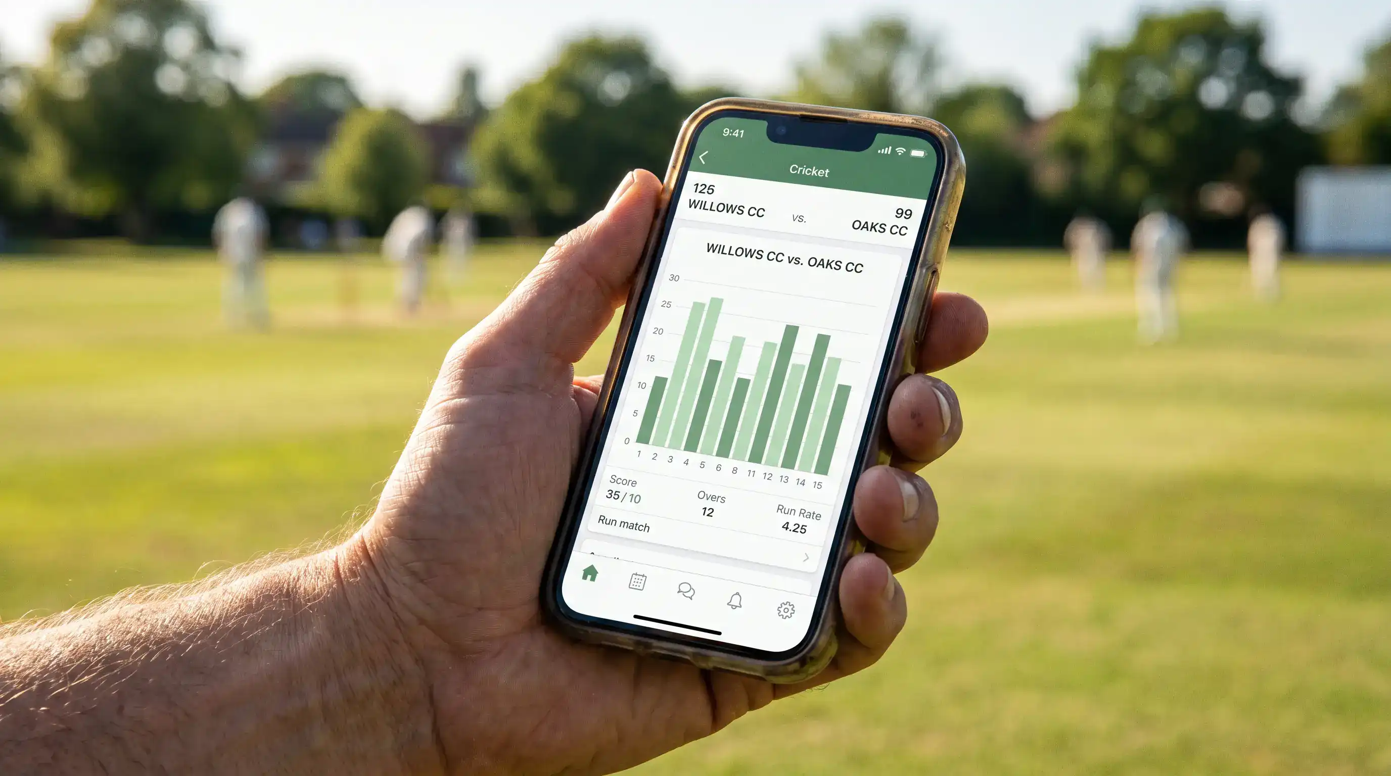
The Manhattan and worm have moved into the club game. The major club scoring apps used in England — the ones tied into the ECB’s Play-Cricket platform — produce Manhattan and worm charts automatically from ball-by-ball data entered on a phone or tablet by the scorer. A Saturday-afternoon league match between two village sides in Surrey will, by the time the players have showered, have a Manhattan and a worm available on the club website for anyone who wants to look.
This matters for how club cricket is followed by people who could not be at the ground. Family members watching from home, players who were away on holiday, prospective recruits looking at how the club plays — they can all read the texture of a match from the charts in a way that a scorecard alone does not give them. The shape of a 240 all-out tells a different story from the shape of a 240-for-9, and the chart shows it.

The other club-level use is post-match review. Coaches at the higher club levels — Premier Leagues, county age-group cricket, the strongest minor counties sides — use Manhattan and worm exports to identify which overs in the innings cost the match. The bar chart turns an over-by-over discussion from “we lost the middle overs” into a specific identification of which overs, against which bowlers, with which wickets falling around them.
The scoring conventions and abbreviations behind these charts — the way each ball is coded into the data — are worth a closer look on their own. Anyone reading a live cricket scorecard regularly will find that the Manhattan and worm are simply two visualisations of the same underlying ball-by-ball record that the printed scorecard tabulates. The deeper you read the scorecard, the more the charts make sense; the more you read the charts, the more the scorecard’s notation falls into place. For a fuller walkthrough of how the scoring conventions work, the cluster on reading a live cricket scorecard is the natural next step.
Written by the editors at Stumply.
